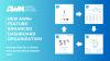
Getting to Know Your Ambient Weather Network (AWN) Personal Dashboard

With AWN, you get a completely free and ad-free personal dashboard, ensuring uninterrupted access to your Ambient Weather station data. However, you don't need to own a weather station to benefit from AWN; thousands of public weather stations provide hyperlocal weather data right in your neighborhood. Whether you're a weather enthusiast or simply want to stay informed about local conditions, the AWN Personal Dashboard keeps you connected.
What is AWN?
Ambient Weather Network (AWN) is a free app and web platform available on iOS and Android, or you can visit www.ambientweather.net on a desktop. AWN is powered by thousands of personal weather stations, including NOAA stations. Its rich data gives you access to a precise hyper-local forecast, historical data, graphing, and time-lapse videos.
Setting Up Your AWN Dashboard
Getting started with AWN is simple:
- Create an Account: Visit www.ambientweather.net or download the AWN app from your device's app store. Sign up for a free account using your email address.
- Add Your Weather Station: Follow the instructions in your station's manual to link your weather station to your AWN account. Ensure your station is connected to your home Wi-Fi network and have the MAC address ready. If you need it, you can always find your station in the list of online manuals.
- View Your Dashboard: Once your weather station is connected, you can start viewing your dashboard.
Accessing Your Dashboard
You can access your dashboard by selecting "Dashboard" in the right-hand corner of the desktop version or by choosing the gauge icon in the app's bottom menu.

Dashboard Overview

- Select Your Station: On top of your dashboard, you will see a drop-down menu. Select the weather station you want to view. You can favorite stations on the map to have them appear in this drop-down.
- Tabs: Below the drop-down, there are three main tabs: Tiles, Charts & Graphs, and Social. We will walk through each of these in the sections later in this blog. If you have a weather camera connected with a Silver or Gold Ehanced Camera Subscription you will also see a Weather Cam and Library tab. To learn more about the Enhanced Camera subscription and its specific tabs click here.
- Interactive Map & Marker: A minimized version of our interactive map with a marker for the selected weather station.
- Map Functionality: You have access to all the same features in the expanded map, including map layers, AWN+, 24-hour, and 7-day forecasts.
- Controls: The plus, minus, and up arrow buttons allow you to zoom in, zoom out, and reset bearing to north, respectively.
- Weather Camera: If you have a weather camera connected, a still of the most recent time-lapse video will be displayed. Select the camera image to switch the map to the most recent timelapse.
- Tiles: Scroll down below the map to view all your available tiles.
- Alerts: You can manage your alerts by selecting the bell in the top right corner.
- Menu: You can navigate to your devices, alerts, account, map, and upgrade to AWN+ in this menu.

- Select Your Station: On top of your dashboard, you will see a drop-down menu. Select the weather station you want to view. You can favorite stations on the map to have them appear in this drop-down.
- Tabs: Below the drop-down, there are three tabs: Tiles, Charts & Graphs, and Social. We will walk through each of these in the sections later in this blog.
- Interactive Map & Marker: A minimized version of our interactive map with a marker for the selected weather station.
- Map Functionality: The two-way arrow lets you hide the map.
- Weather Camera: If you have a weather camera connected, a still of the most recent time-lapse video will be displayed. Select the camera image to switch the map to the most recent timelapse.
- Tiles: Scroll down below the map to view all your available tiles.
- Menu: (From left to right) You can navigate to your forecast, map, dashboard, alerts, create a post, and settings.
Tiles
Overview
The tiles on the dashboard represent the data from the weather station you selected in the drop-down. These tiles include :
- Forecast
- Wind
- Rainfall
- Pressure
- Humidity
- UV Index
- Indoor Temperature & Humidity
- Batteries
- Sun/Moon
- Quick View
- Add-on sensors ( i.e., lightning, leak, soil moisture, etc.)
- Growing Degree Days (Premium AWN+)
- Cooling Degree Days (Premium AWN+)
- Heating Degree Days (Premium AWN+)
Expanding, Sharing, and Removing Tiles
Under each tile, you will see the following symbols.

Going from left to right, these symbols allow you to:
Expand: The plus symbol expands the tile for more detailed information. For example, the Outdoor Temperature tile expands to show today's, yesterday's, this week's, this month's, and this year's min, max, and average. Once expanded, the plus symbol turns into an X, allowing you to return the tile to its original size.
Graph: The line graph symbol jumps to that measurement's graph on the "Charts & Graphs" tab.
Share: The arrow symbol allows you to create a post on AWN or share the tile via Facebook, X, or email.
Hide: The minus symbol hides the tile if it isn't relevant to your dashboard. You can re-add hidden tiles by scrolling to the bottom of your dashboard and selecting "Add back to dashboard" in the lower right-hand corner.
Graphing and Charts
Overview

This section allows you to dive deeper into your data. Choose a date range to view historical trends via graphs or charts. You can also filter to show only specific measurements. Graphing and charting are great ways to identify trends or see how measurements change when a storm approaches.
- Date Range: Change the date range in the top right corner. The free version of AWN gives you access to a year's worth of data, while AWN+ provides up to three years.
- Toggle: Switch between graphing and charting.
- Filter: Show only the measurements you care about.
- Legend: Identify the colors on the graph using the legend.
- Hover: Hover over any graph to see individual data snapshots.
Exporting Your Data
On the chart tab, you can export your data by selecting the export icon in the top right of the chart. First, choose the date range of the data you want to view. Then, select "Export All Data" for a detailed breakdown or select "Export Daily Summary" for a more condensed report. Each will download as a CSV file.

Social
Overview
Under the Social tab, you can view social posts on the Ambient Weather Network within 100 miles of the selected station or only view posts from that selected station. You can like, share, and comment on these posts. Create a new post by selecting the plus sign in the bottom right-hand corner.

- View Posts: Select "Within 100 Miles" or "Station Only" to filter posts.
- Interact: Like, share, and comment on each post.
- Create Posts: Create a new post by selecting the plus icon.
Conclusion
The Ambient Weather Network (AWN) Personal Dashboard is a powerful tool that keeps you connected to hyperlocal weather data, whether you own a weather station or rely on public ones in your area. With easy setup, customizable tiles, detailed graphs and charts, and social connectivity, AWN provides a comprehensive and user-friendly experience. By exploring and utilizing the various features of your dashboard, you can stay informed about your local weather conditions, track historical data, and share insights with a community of weather enthusiasts. Start using AWN today to enhance your understanding and enjoyment of the weather right in your neighborhood.
Join the Ambient Weather Network by downloading our free app on iOS or Android.
-
 How to Monitor Air Quality to Reduce Allergy Symptoms
-
 Ambient Weather Network Now Supports Up to 16 Soil Moisture Sensors—Here's What That Means for You
-
 What Is SKYWARN? How Trained Storm Spotters Support Severe Weather Safety
-
 Embrace the Spring with AWN: Your Weather, Everywhere
-
 Your Weather, Your Way: Introducing Enhanced Dashboard Organization on AWN+